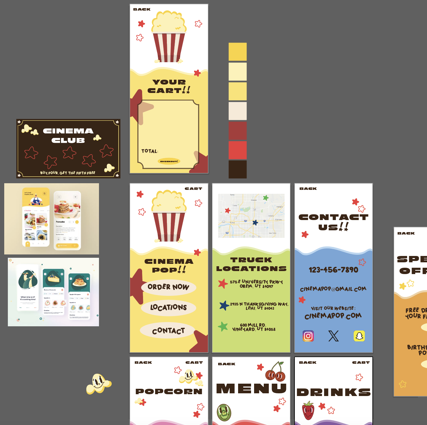
One of the projects I developed for Cinema Pop, a fictional popcorn food truck brand, was a prototype app that allows customers to order their favorite creative popcorn flavors. I used Adobe Illustrator to design the interface and Adobe XD to make the pages and buttons fully functional.
When approaching any new project—especially something I’ve never tackled before—I begin by gathering inspiration. Pinterest is my go-to for exploring layout ideas, color schemes, and trends. This helps me visualize how to best communicate the emotions and messages I want to evoke. Since this app was part of a larger branding project, I made sure to stay consistent by incorporating Cinema Pop‘s color palette, fonts, and signature brand elements like playful characters and retro shapes into my vision board.
What made this project particularly fun was blending recurring themes with new ideas. The Cinema Pop brand has a modern twist on vintage movie theater aesthetics—think bold, blocky typography and cheerful cartoon characters. One of my favorite design elements came from the “Cinema Club” punch card I had previously created. The card’s border resembled a classic movie ticket, and I carried that design into the app’s “Cart” page, where customers can view their selected items, tying the brand’s playful nostalgia into the digital experience.